Notan for Portrait Design
August 16, 2026
I started practising portrait drawings by following tutorials and online courses. The results got better at a steady pace but I found myself spending quite a while on each study. At the back of my mind I wanted to have one of these perfect sketchbooks that you see with everything finalised and looking great. Not long ago I flipped that method and just started rough sketching as many heads on a page as I could in pencil and I felt my drafting skills improved greatly. There are still lots of angles and features that are weakness areas in my drawing, but working through them at volume has helped me to quickly pinpoint those weaknesses, take a note and if I get round to it dedicate a page to practising these elements. I'm far from the imagination stage of drawing heads, but I draw using construction to help me place the perspective before I begin adding any other details. I always work from reference (Pinterest) and that meant I was continuously judging the analogue levels of light and shadow.
For this page, I added an additional element to my sketches: every single head got run through the Notan Generator before I inked it, reducing each reference down to a flat value map first. This saved my brain the effort of reading light and shadow straight off the photo by instinct. The tool also has a threshold slider that I used to work on some compositions until I was happy with the amount of information shared using just black and white.
I should say that the notan doesn't replace the reference. I'm still working from the photo the whole time, going between the two so I can bridge my understanding of what the tool has done and what's actually there. Ideally this will train my eye to interpret these values on its own, without needing to run through a tool first. What it gives me is the composition and design of the shading, worked out separately, before I bring the two together on the page. Accuracy has turned out to be less of a draw than watching how a few shapes can be read as a clear face, and that's where I've found these studies worth doing. I'll hopefully be extending this into still lifes and landscapes in the future.
Notan studies of heads and hands
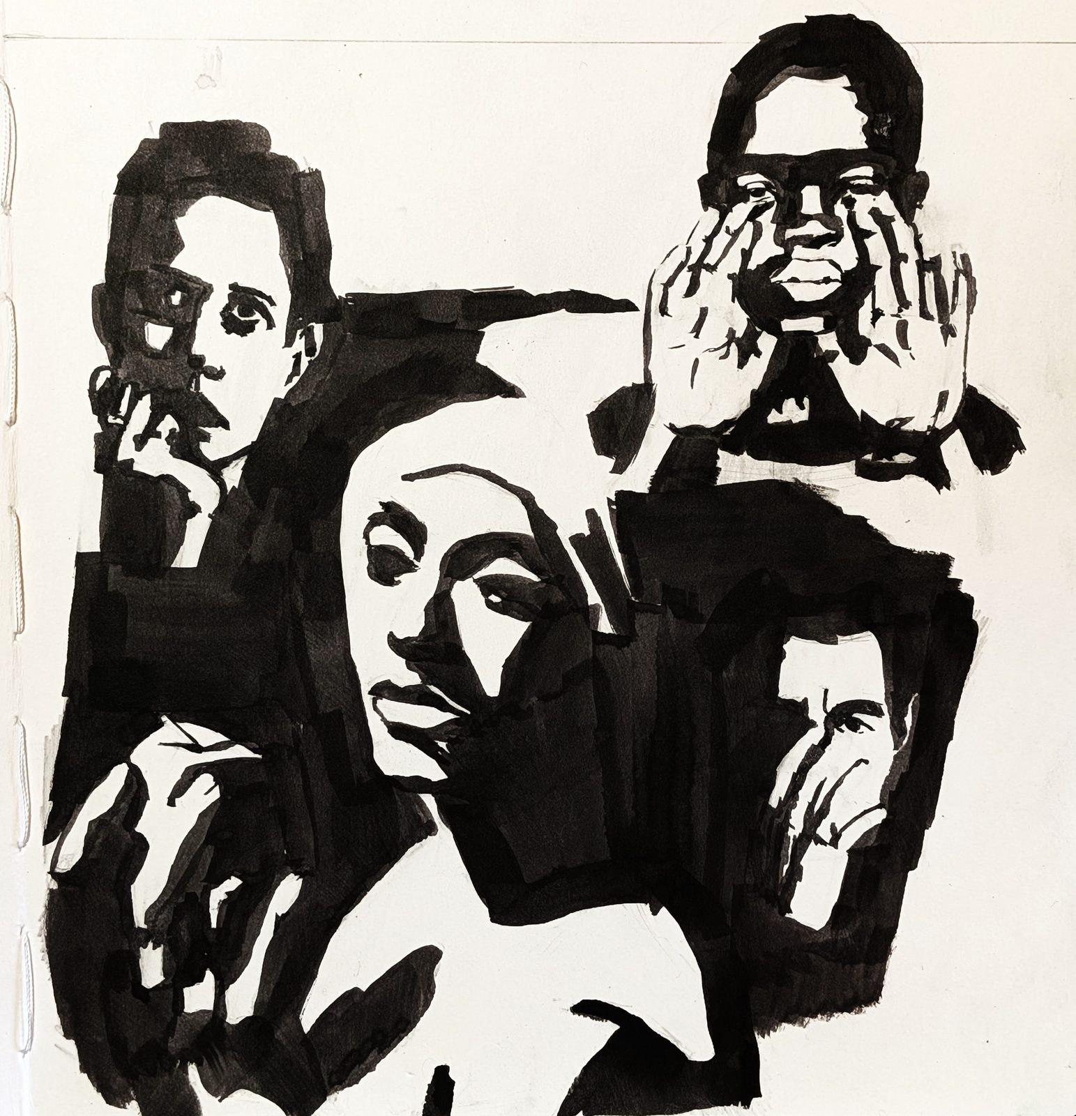
The main sketchbook entry I produced from this study is a cluster of heads with hands in the compositions. I chose those on purpose. Hands are a weak spot I'm actively pushing on at the moment, because they give you the opportunity to add so much expressiveness to a piece, complementing the expression and gesture of the face. Put together with the notan study, it was surprising to see how much a face, or a hand for that matter, can be interpreted and still read correctly with only two values to work with, and I certainly felt the value in observing this way.
Not every sketchbook head is a keeper
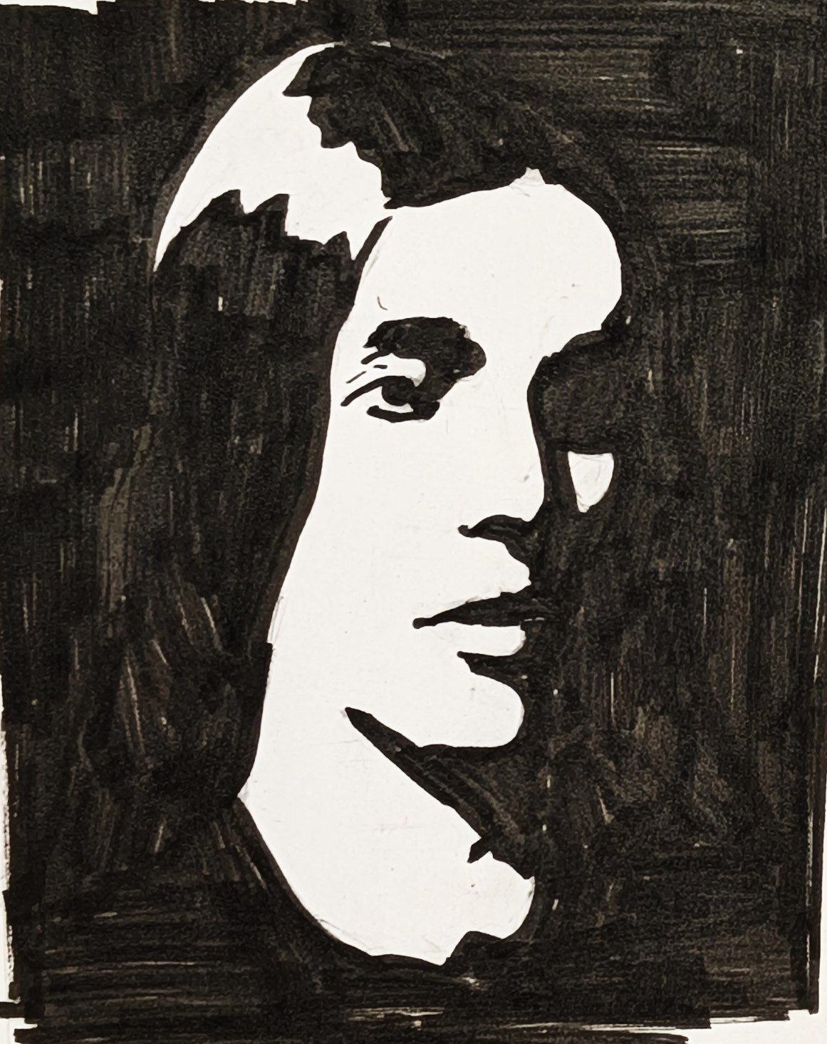
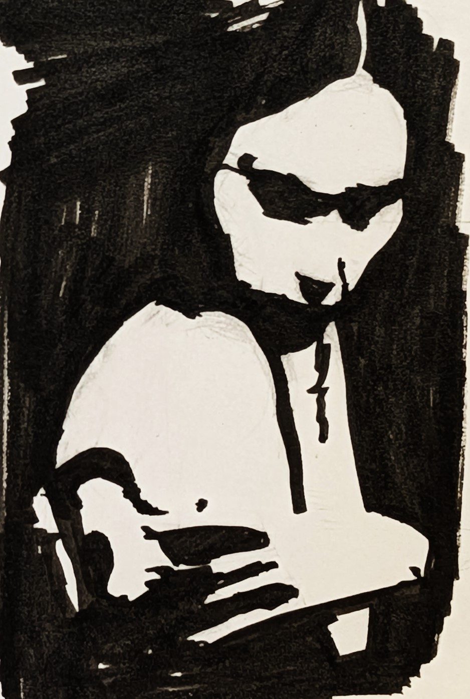
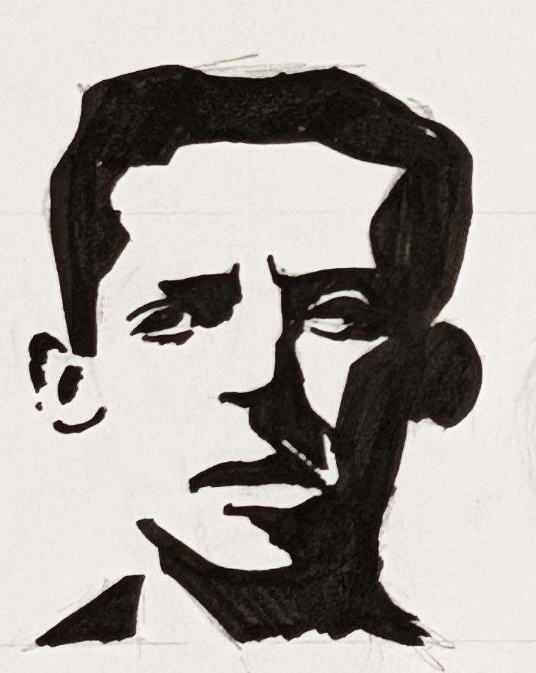
I used the opportunity to run through some individual sketches as well during this study. They are not perfect, and the best use I can see for them is in planning, design and warming up prior to painting or rendering. A sketchbook page doesn't have to be a set of finished portraits. Some heads land better than others, done at different points and at different speeds, and that's fine. One of the biggest realisations I've had recently is that a sketchbook is for practising at volume without needing every attempt to be good. What I take from a page is the repetition and the lessons learned along the way, more than any individual result. It's led to me filling up more sketchbooks now, and I date them so I can look back and see how much I've improved.
Construction lines behind the ink
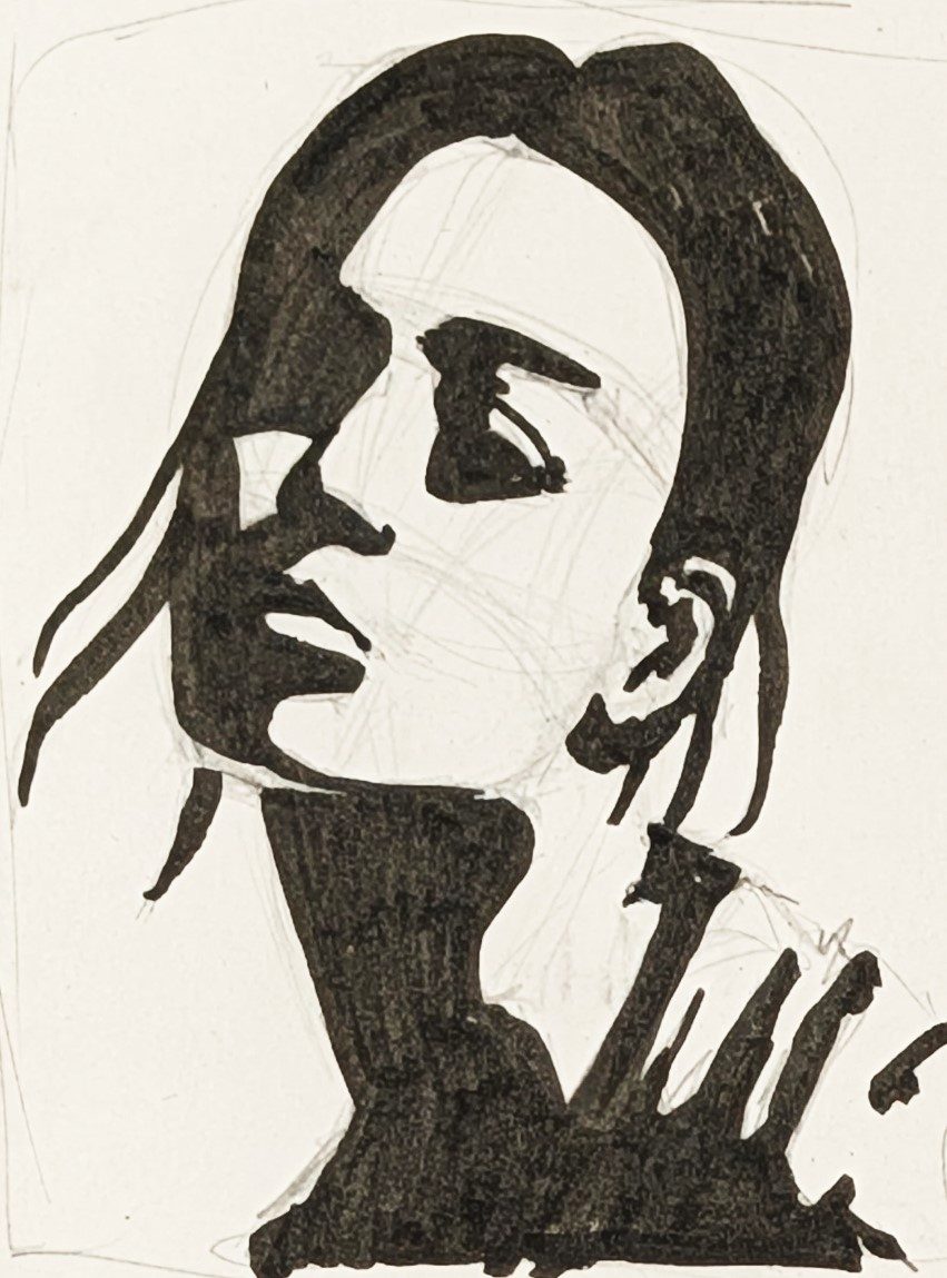
I wanted to include the above drawing, left with its pencil underdrawing showing, because I never inked these freehand straight from the reference and I'd rather that was clear. There's a construction pass underneath first that helps me work out the proportions before committing in ink, and that is still a skill I'm working on at the moment. Leaving the pencil visible on this one records part of the process behind the inked result.
This particular reference didn't stop here either. It later got a full coloured pencil rendering, which shows up in Pushing Past My Comfort Zone in Coloured Pencil.
What this notan exercise taught me
What stuck with me after this exercise was how much information two flat values can carry, and how much freedom that gives you to interpret the face instead of copying it. Notan is going to stay part of my process from here on, mainly as a design and composition study done before I start rendering.
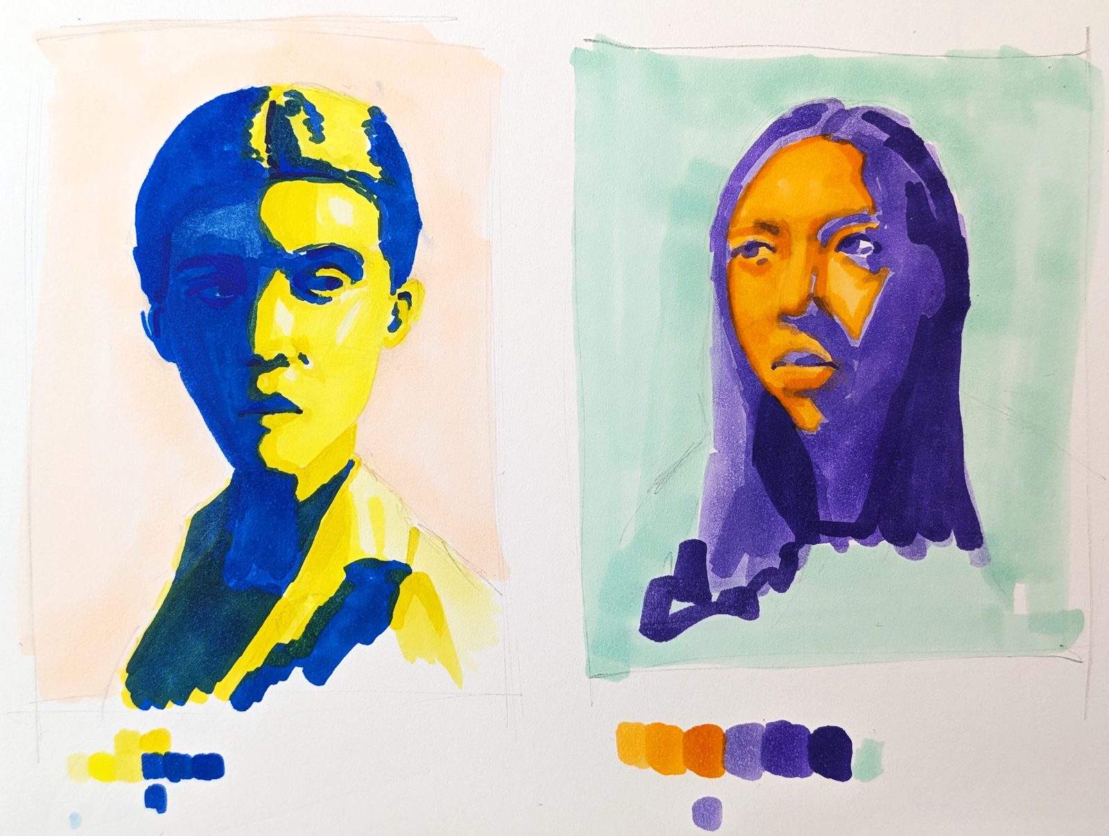
As an additional exercise to this, I spent about 30 minutes on two additional colour studies, as a rough test of whether the same observation of simplified shapes held up once the value buckets become colour pairs instead of just black and white. That's really its own experiment though, worth a proper post of its own in future.
Materials used
- Faber-Castell 9000 pencil
- Staedtler pigment liner (refilled)
- Dr. Ph. Martin's Black Star pigment ink
- Rohrer & Klingner sketch ink
- Stillman & Birn Zeta sketchbook