Six Heads, Three Sheets: Pushing Past My Comfort Zone in Coloured Pencil
August 23, 2026
Following on from Testing the Zorn Palette in Coloured Pencil, I wanted to push the pencil work a bit further, so I rendered six heads across three sheets of cold-pressed watercolour paper and made a point of choosing subjects outside my usual range, with different complexions and different ages, instead of going back to what I find comfortable to draw. It was a way to take some of what I've been studying recently and put it into practice. I'm always looking to improve, and the best way I've found to show up my weaknesses is to make more work, then sit back and analyse it once I'm finished.
I used a mix of Faber-Castell Polychromos and Caran d'Ache Luminance across the six pieces. For the tools, I ran the references through the Notan Generator for the initial value read, used Paint Mixing's colour pencil matching mode so the samples pointed at a specific brand of pencil, and checked the underlying design with Shape Simplifier. Afterwards I realised I hadn't recorded palette swatches for the pencil choices on any of these, which I'm aiming to do on future work, as it would give me something to look back on for all the colours used in a portrait and how the value gradient was built up.
Sheet one: beard, shadow, and getting the brow right
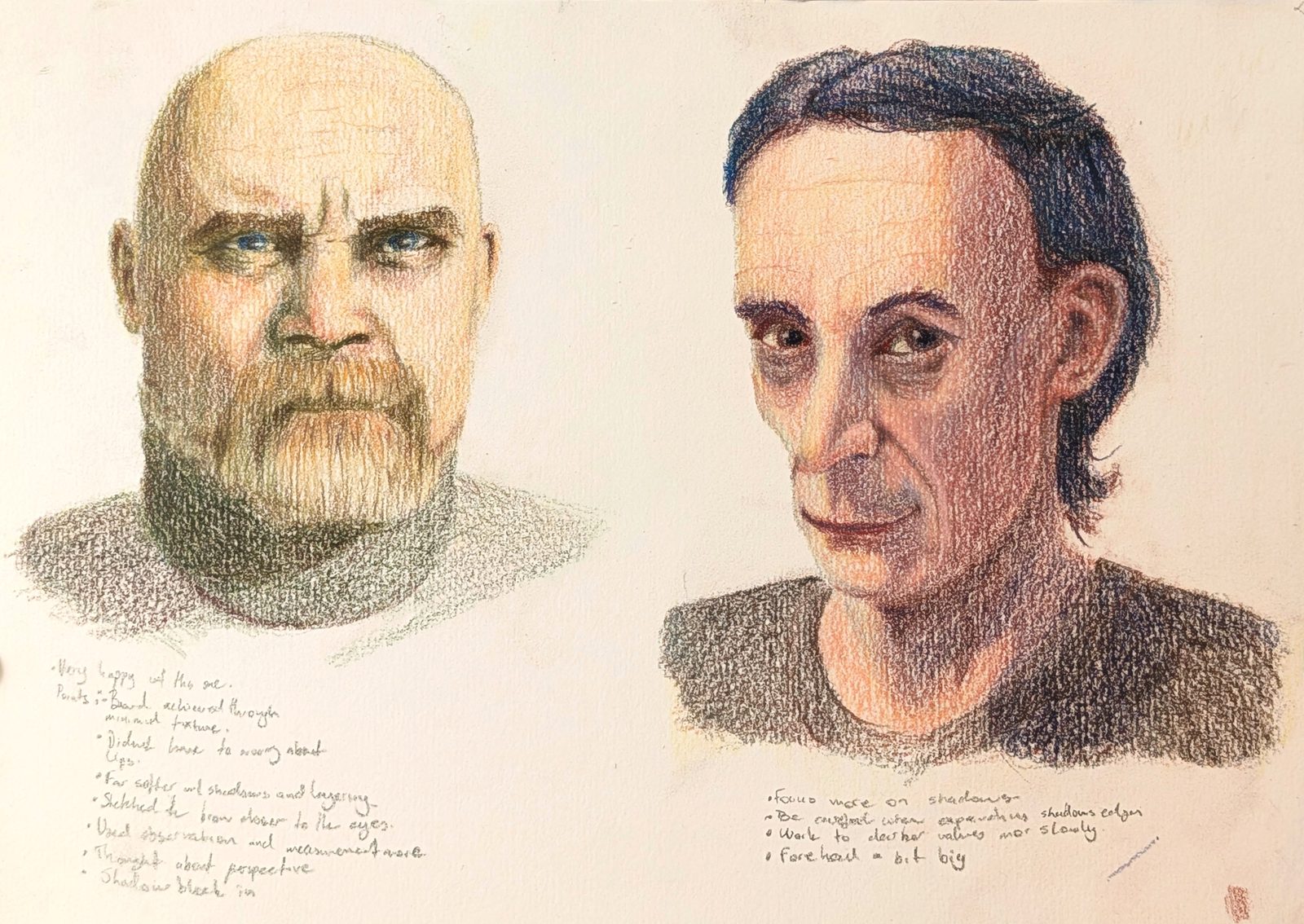
Notes on the left head: I was quite pleased with this one. The beard came from very little texture, and I didn't have to worry about lips. I kept the shadows and layering fairly soft, sketched the brow closer to the eyes than I normally would (I often sketch the eyes too low in the proportions, which in some of the other examples here makes it feel like the sockets are recessed too far into the skull), leaned more on observation and measurement, and thought about perspective while blocking in the shadows.
Notes on the right head: I tried to focus more on the shadows and on pushing the value of the piece. I noticed I have to be more careful when separating shadow edges, and darken the values more slowly and on purpose. As with most of this learning process, looking at it later I can see things off with the proportions, but I think the point is to keep working through as many of these as I can.
Both were done with Polychromos, dipping into the set and pulling out whichever colour I thought looked right. The two references came from Pinterest, and I chose them because they had a clear shadow structure that made the form easy to read.
Sheet two: rendering age, and a callback to the notan study
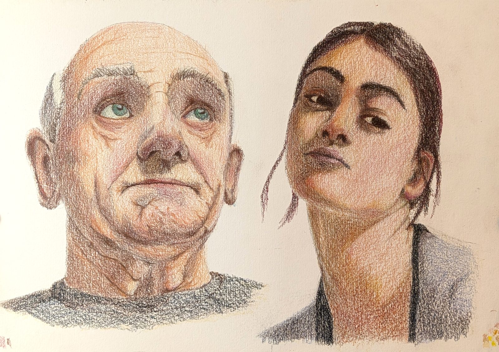
Another two references from Pinterest, this time to try two things: how rendering an older person would change my approach, and whether I could use a previous study to drive a new drawing. I used Caran d'Ache Luminance for the older character and Polychromos for the woman.
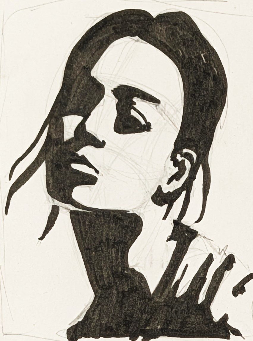
That's the same reference I used for the profile study in Notan for Portrait Design, the one I left with its pencil construction lines showing. Coming back to it here and rendering it fully in colour was a good test of how much changes once colour and layered value go on top of a study that started out as flat notan shapes.
Sheet three: pushing complexion and colour further
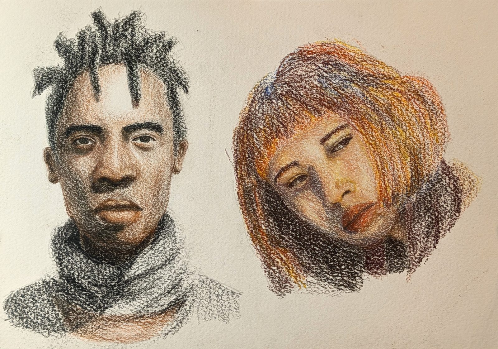
I wanted to push further again with these two, choosing different complexions specifically so I could test different pencils. The left head was rendered with Polychromos and the right with Caran d'Ache. For both I used the colour sampling in Paint Mixing, picked a range of swatches and pulled the closest pencil match for each. In a few places the nearest match felt slightly off, so I went with the tool's hue suggestion and reached for a second pencil that caught the colour shift through the layers, which meant green in the shadows for the male head and blue in the shadows for the female.
What rendering reveals
I sometimes feel I've laid down a good foundation, and then as the colour layering builds up value and depth I start noticing the small things that are off in the drawing underneath. Rendering and shading can sculpt those shapes into something closer to the reference, up to a point, and I do get a lot out of that stage, but there's a limit to how much it can fix. It's a strong argument for getting the drawing right in the first place instead of counting on the rendering to rescue it later.
The eyes weren't the only problem. I noticed it across all the features in this set, and I seem to have consistent trouble with eyes, noses and mouths. So I'm planning to give a few pages over purely to rendering individual features and see if I can work out where I keep going wrong with them.
Restraint over emphasis
Working with older muses on this set meant dealing with the subtle shading that wrinkles and age put into a face, and looking back I went too far with the tones in those areas. I'll need to hold back more with wrinkles and texture the next time I draw an older subject.
It's a reminder that, more often than not, a subtle touch reads stronger once you step back from the piece than heavily emphasising whatever you're trying to capture, and that the viewer's eye will fill in the gaps if you let it.
Where this goes next
Both of these threads, the drawing stage mattering more than rendering can fix and wanting more goes at getting proportions and features right before colour comes in, lead back to the same place, which is more time spent just sketching heads in pencil, lots of them, across proportions, stylisation, emotion and ages. That's probably a post of its own at some point. In the meantime I can't wait to get stuck into some painting.
Materials used
- Faber-Castell Polychromos pencils
- Caran d'Ache Luminance pencils
- Cold-pressed watercolour paper