Testing the Zorn Palette in Coloured Pencil
August 22, 2026
Following on from Notan for Portrait Design, this one moves into using some of the coloured pencil stash I have. Before committing to anything larger, I wanted to test the potential of the Zorn palette for a coloured pencil portrait. This post covers the palette itself, the pencils, four quick studies and one mid-sized piece, all of which were there to work out a process and give myself room to experiment before I went any bigger. The larger, more finished pieces working across a few different palettes are their own post, coming next.
The Zorn palette vs. a fuller pencil range
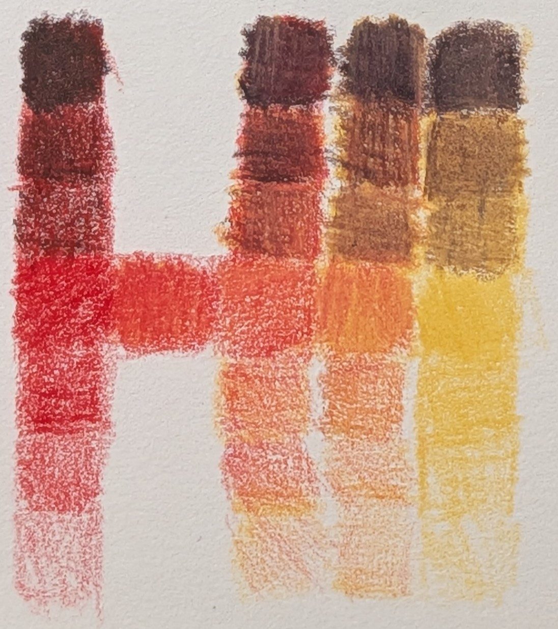
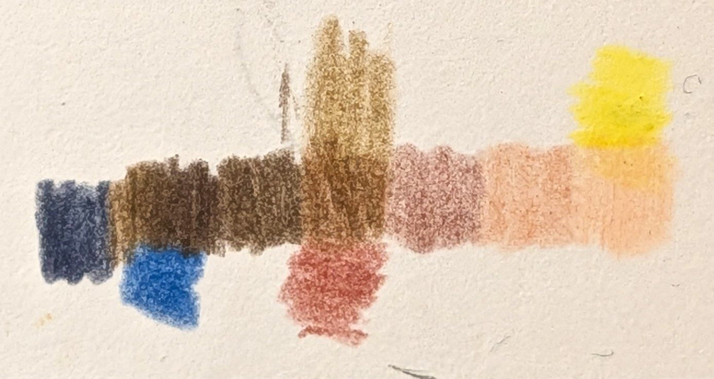
I used Cadmium Red Light, Ivory Black, White and Naples Yellow. For the wider range I just looked for similar tones to the reference image using the colour-sampling feature in Paint Mixing and matched the closest pencil I thought related to that colour.
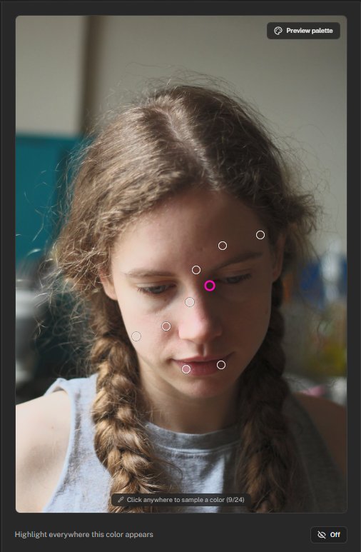
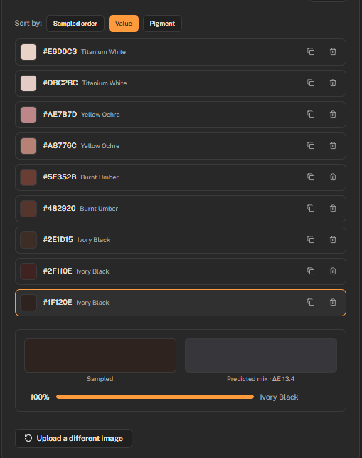
The swatches above are arranged by value, using the tool's sort option, which makes it easier to see where the reference actually sits tonally, separate from hue.
Using the sketchbook for the initial colour studies, I was hoping to discover the potential of Zorn applied with layering pencils, as I've seen it produce great results in many other mediums.
Faber-Castell Polychromos pencils
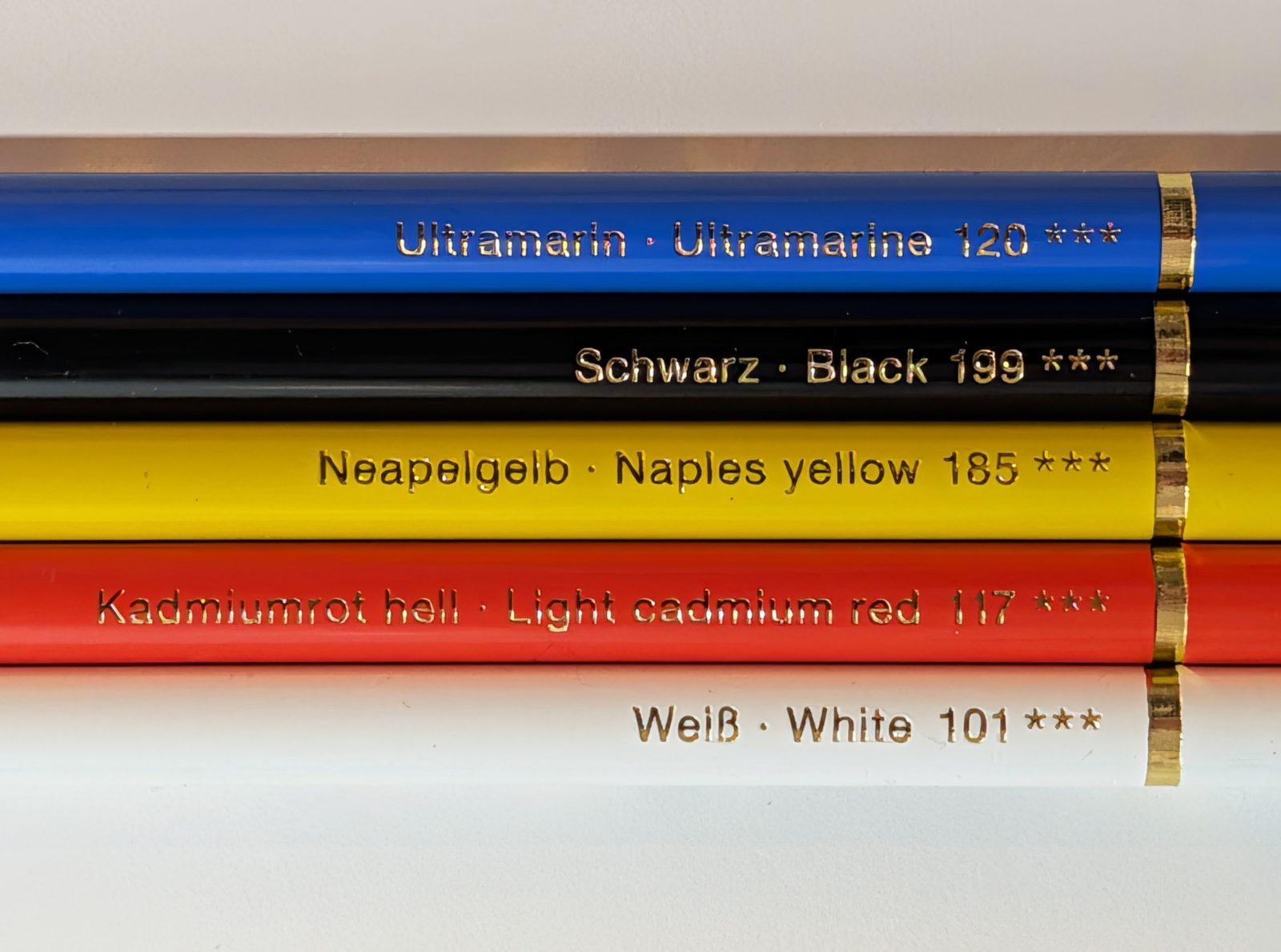
The pencils used for this portrait are Faber-Castell Polychromos. Out of Caran d'Ache and Derwent Lightfast, these are my current favourites. The layering is smooth, and on the right paper you can delicately add layer upon layer without a smudge in sight.
Four studies: notan and rough colour
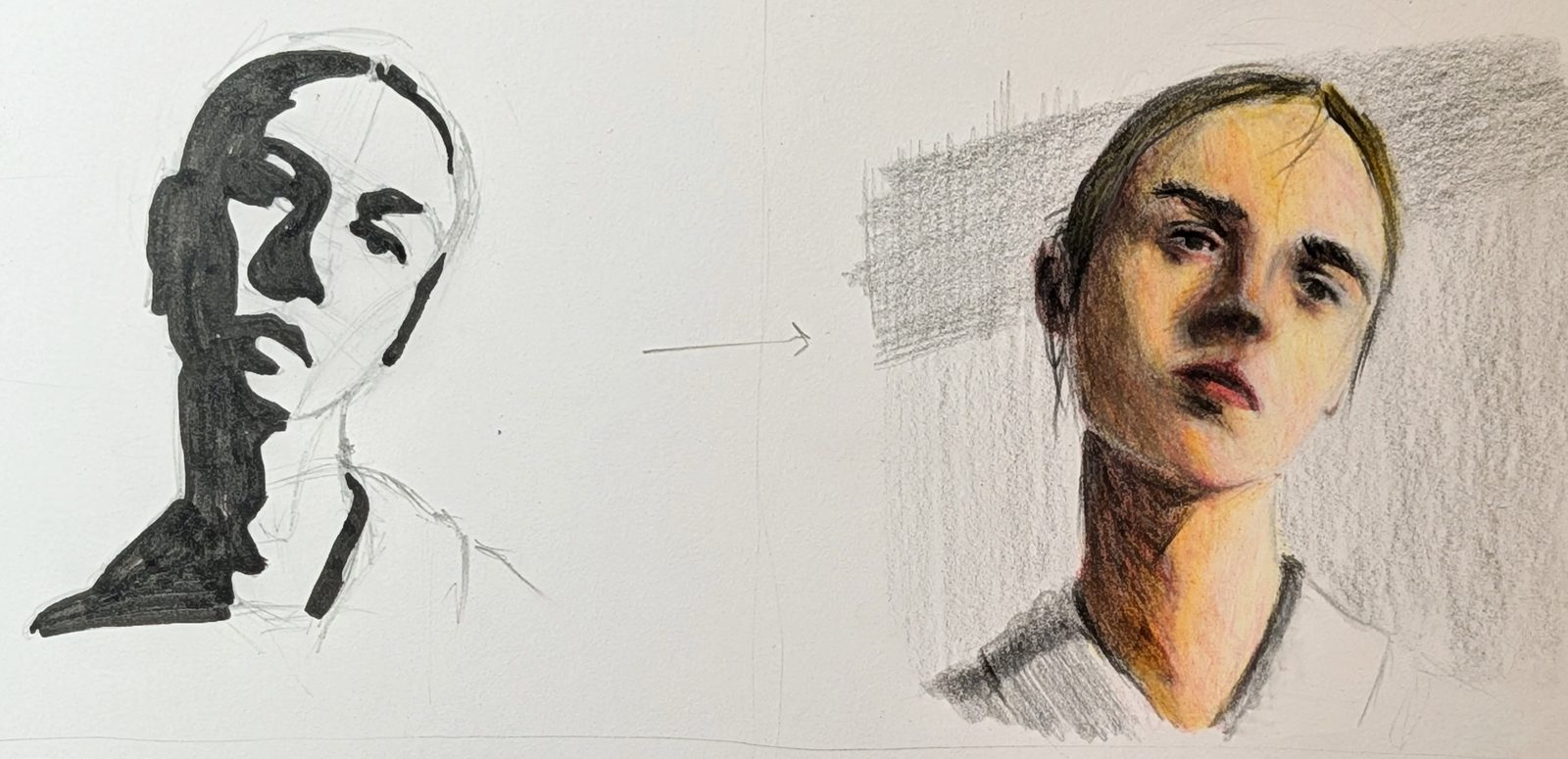
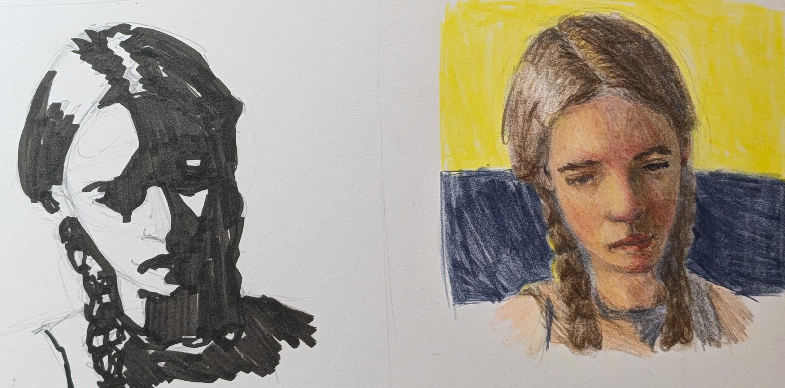
These two colour studies are far from being finished pieces, and that's the idea with sketchbooking, the same as in the notan post: the study earns its keep by doing the job it was made for, and whether it looks good on its own is beside the point. Two are notan value studies, run through the Notan Generator the same way as last time, working out the shape design before any colour is added. The other two are rough coloured pencil passes, testing how the Zorn palette handles skin and shadow once colour enters the picture, compared against the wider palette built from Paint Mixing's colour-sampling tool. I'll admit part of me wanted these studies to be perfect in their own right, and I had to fight the frustration when proportions or colours weren't working out. I kept reminding myself of the actual purpose of the drawing, though, and pressed on.
Once I got past that, I was pleasantly surprised at how the Zorn combination created a natural-looking light in the piece, versus the oversaturated yellow tint from my other palette choice. I still appreciate the expanded palette's result too, but it got me thinking that palette choice should follow the actual lighting on the subject and not an assumption about their skin tone. It's a theme I keep running into: observing carefully and putting down what you actually see, rather than what you think you see. It also got me wondering whether I could keep an image's shadow shapes but freely choose my own palette and change the lighting entirely. That would be a step further from copying the reference, and maybe a bridge toward looser stylisation later on.
Artists I keep thinking about
One artist whose work I keep coming back to while doing this kind of piece is Chris Hong. Their sketchbook is full of fantastic pieces, well beyond the studies I'm doing here, and it's incredible to see how they apply the pencil, build the shapes and stylise the image. What strikes me most is the use of colour. Sometimes what looks like a strange combination on paper ends up capturing the portrait beautifully, opening up colour choices based on emotion and style rather than strict accuracy, and it's well worth a look.
The Zorn palette portrait
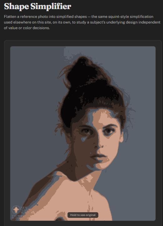
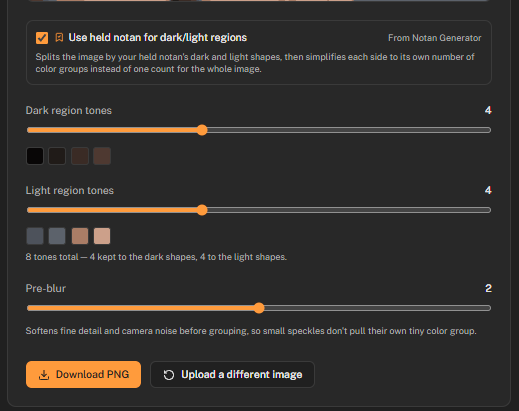
Before starting this piece I ran the reference through the Shape Simplifier, masking off the lightest and darkest areas so I could see where the value extremes actually sit in the image instead of guessing at them. The two screenshots above show it using a held notan mask to split the image into dark and light regions first, then simplifying each side to its own set of tones, rather than flattening the whole image to one shared count. I also drafted the construction using a combination of Loomis and enveloping. The Line Contour tool can be useful for some images if you want a print or trace to work from, so you can focus purely on rendering.
Typically with these value studies (notans) I'll drag the threshold to one extreme and slowly work it back until I get a representation I'm happy with. It's a personal choice, and even I might land on a different read doing the same image another day, so feel free to try it as many times as you need.
In truth, I ended up deviating from it quite a bit as the piece went on. I got caught up in controlling the palette colours and was hesitant to commit to the black. Still, using the Shape Simplifier with the notan mask kept the light and dark values properly separate (a recent focus of mine: making sure the lightest dark is never lighter than the darkest light), and it gave me a useful starting point for the value structure before colour entered the picture. The final result still reflected those initial shapes, marked lightly in pencil before rendering.
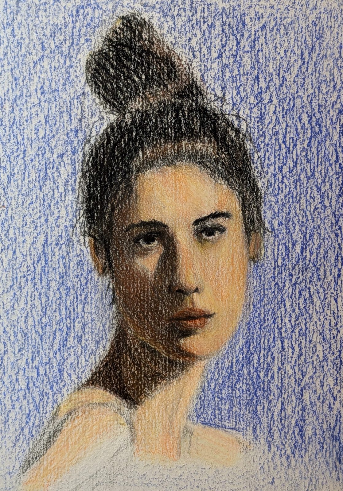
This is the actual test: one mid-sized portrait, Zorn palette only, with a cheating ultramarine blue for the background. The larger format and cold-pressed watercolour paper were far more forgiving than a sketchbook, with more tooth to hold the pigment and more room to sculpt the tones. The reference had clear blue in the shadows around the eyes, and I had to resist reaching for that ultramarine there too. I'll try another Zorn study with that blue included, to see how far the limited palette can stretch. Getting the shadow value right meant going heavy on black without washing out the colour, so I kept layering black, red, yellow, then black again to hold onto some colour in the darks. The hair needed extra black too, to keep it reading separately from the skin shadows. I thought I'd finished, stepped away for 20 minutes, then came back and found the lights leaning too yellow, so a bit more red and some careful black to desaturate brought it back into balance. I could have pushed further, but felt the fear building the more black I added. Note to self: be bolder next time, since none of these are portfolio pieces anyway.
I really like the overall result. Stepping back, I enjoy the lighting it creates and how much room there is for depth. Continuing to practise with this palette should build my control and observation, and stretch my problem solving for colour work. I wish I'd approached rendering this way before buying the largest set of colours available in pencils, but I'm looking forward to finding ways to fold them back into a palette like this.
Where this goes next
My next task is somewhat larger pieces with a wider range of pencils. I'll try a different approach there too, keeping the full range at my side and reaching for whichever pencil feels right, rather than working from a fixed set.
Materials used
- Faber-Castell Polychromos pencils
- Stillman & Birn Zeta sketchbook
- Cold-pressed 300gsm watercolour paper