Drawing the Nose: The Wrong Person Under the Right Light
September 10, 2026
Second feature, same three stages as the eyes: a slow pencil study to learn the form, a sheet of ink studies with no underdrawing to test it, then one in gouache to put the colour back. This one didn't go the way I wanted, and working out why is most of what this post is about.
Pencil first
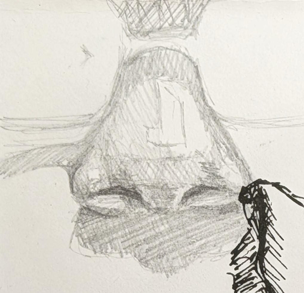
One rendered nose in pencil, slowly, paying attention to how the value turns across the bridge, the ball and the wings. The interesting thing about a nose is how little of it is actually edge. Most of what tells you it's there is the shadow it casts and the planes around it.
Ink without a net, again
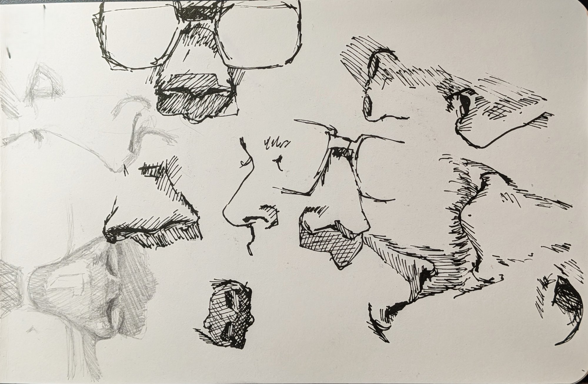
Same rule as last time: no pencil under the ink. What I found is that a nose is defined as much by its surroundings as by itself. You can get away with surprisingly little on the nostrils, and it's usually better that way; overstate them and the whole thing tips into something pig-like. But the shadow shapes around the nose, the one under the ball, the one down the far side, the one tucked against the cheek, are what push the illusion of form, and in black and white they're doing almost all of the work.
The dot-mapping from the eyes post carried over. I measured the relative distances between a few reference points, dotted them onto the page, and that gave me enough confidence to commit ink without a construction drawing underneath.
The gouache, and what went wrong
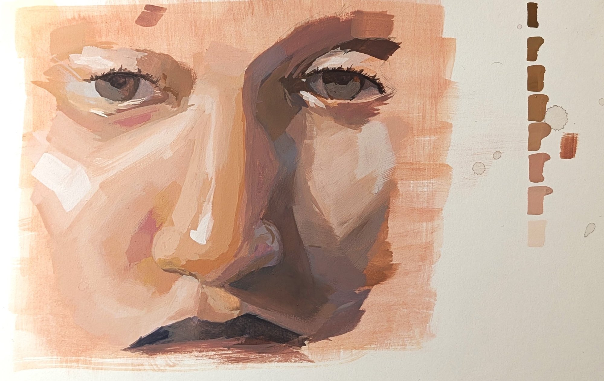
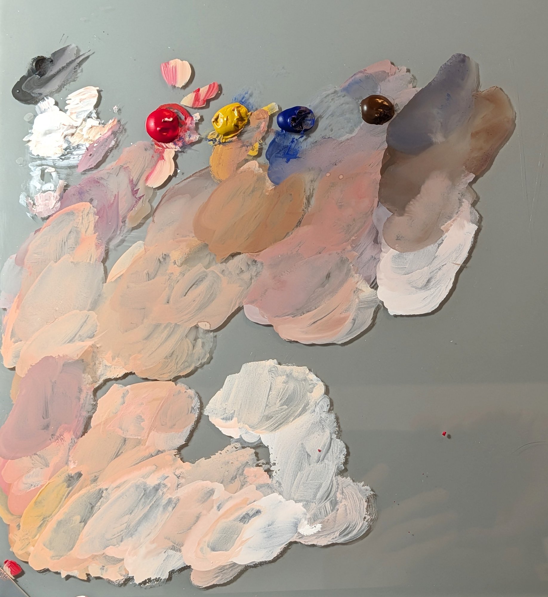
Planned the same way as the eye: Shape Simplifier to find the big shapes, then Palette Extractor for a working palette. Because the nose turned out to be about its surroundings, the study grew to take in the eyes and the top of the mouth as well.
I'm not happy with it as a likeness. Mixing for this complexion was hard and the result doesn't do the person justice; the skin I ended up with isn't theirs. On top of that, the same fault as the eye study came back. I underestimated the darks, went in too light, and then had to push them further and further, and every push shifted the tonal balance of the whole piece and needed correcting somewhere else. If you make too many moves before the value structure is settled, you end up correcting everything twice.
The wrong person under the right light
What made it worth doing is that the lighting survived. The painting doesn't look like the person in the reference, but the light comes from the same place and the shadow shapes fall where they fall in the photo, and the value relationships are the reference's even though the colour and the likeness aren't. I painted a different person under the same light. That's useful to know, because it means a photograph can be a reference for lighting on its own, separate from who's in it.
Next
Two changes for the mouth. On the page I'll put down a value wash first, a thin grisaille that captures the notan before any colour goes down, so the darks are settled before I start mixing and I'm not chasing them afterwards. It's the notan thinking from post one again, only in paint. On the site, this study is the reason Palette Extractor now shows a ten-step value scale under the swatches, with each colour marked at its lightness. If I'd had that before this painting I'd have seen that the darks I was mixing were sitting far too high on the scale.

As with Six Heads, I'll keep varying the complexion as the series goes on. It's the thing I most need to get better at, and one nose won't do it.
Materials used
- Holbein Artists' Gouache
- Staedtler Pigment Liner
- Graphite pencil
- Stillman & Birn Zeta sketchbook
- MasterTouch Aquamarine watercolour flat, size 4
- Princeton Aqua Elite round, size 8